
Strategic use of color
We must be strategic when using color. Keep in mind that color communicates and can make a message succeed or fail. Being cautious and consistent in the use of color and sticking to the defined color palette will help us stay on brand.
Main palette
These are Quadiontech's brand colors. Its use reinforces the visual identity system and the quick association to the brand.
Click the color to copy its value.
Tips
Some tips to keep in mind when using color:
Contents
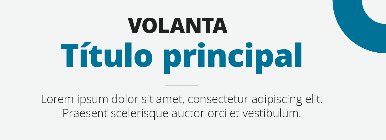
Long texts should be set in black or dark gray. Quadion's blue works best for titles and graphic elements.

Contrast
Enough contrast guarantees proper and easy reading for all audiences.

Color ratio for light background work
Predominance of white, followed by grays and black for content and blue and orange as highlighters.

Color ratio for dark background work
Predominance of blue, white content with details in gray, black and orange to highlight information.
Extended palette
The extended palette offers color swatches for cases where the main palette is not enough.
Click the color to copy its value.
Try the extended palette in charts
Color for icons
Quadion has a color palette for icons and illustrations.
Click the color to copy its value.