Iconography
We use icons as a way to reinforce messages and generate visual interest. Their main features are their simplicity and appeal.

Selection
Since we haven't designed our own icon library, when picking icons, we must make sure that they comply with certain characteristics:

Simplicity
Always choose the least visually complex icon between two options that seem right.

Clarity
Pick icons that are easy to understand and that convey a clear and concise message.
Consistency
Use icons that share the same characteristics as their peers and environment.
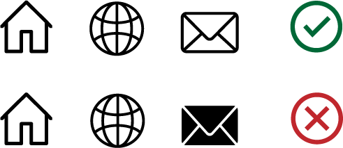
Stroke width
When choosing icons, the stroke width of all icons should be similar so that they look like they belong to the same family. If necessary, adjust the stroke width in an image editing program.

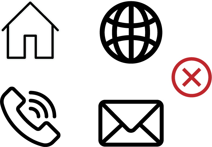
Vector vs. Bitmap
When possible, use icons in vector format (.svg) to display them at the best quality and avoid pixelation from scaling.


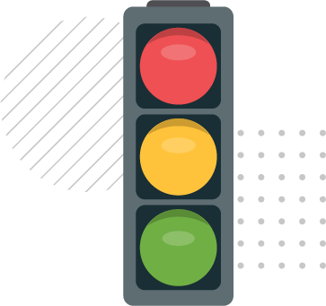
Illustrated icons
We use illustrated and more complex icons in several communication pieces for enhanced visual interest. These icons should follow the color palette for icons available in the color section.